Hello, I'm Tyler Lange
a Product Designer from Vancouver, working globally.


Recent product design for a decentralized lending platform called Ajna. Entire site, dashboard app, UX and UI components are my design. Visit https://ajna.finance or https://ajnafi.com
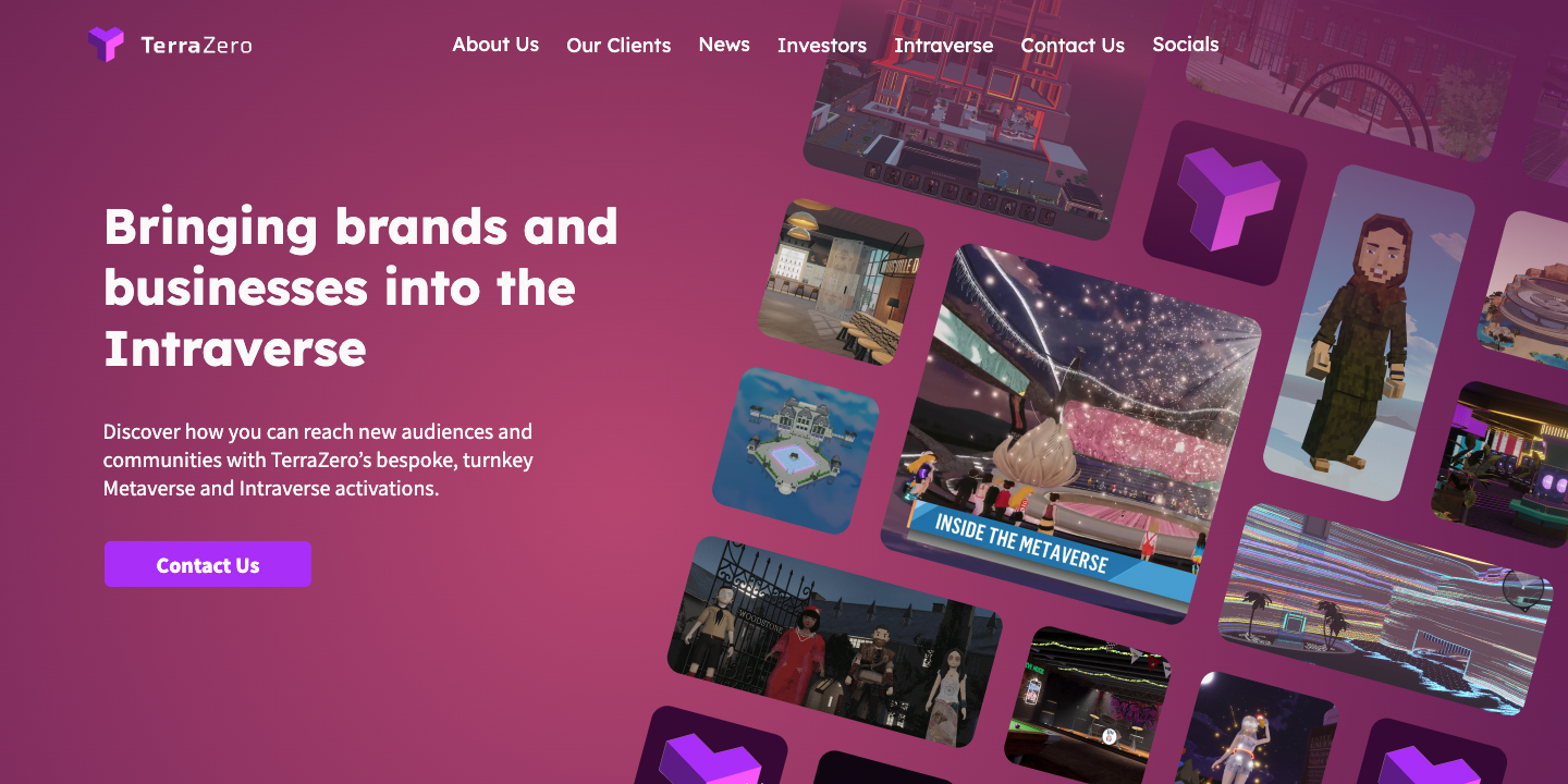
I had the pleasure of designing the TerraZero brand, website, platform UX and all UI components for their Intraverse project. Also helped with supporting graphics and pitch decks.
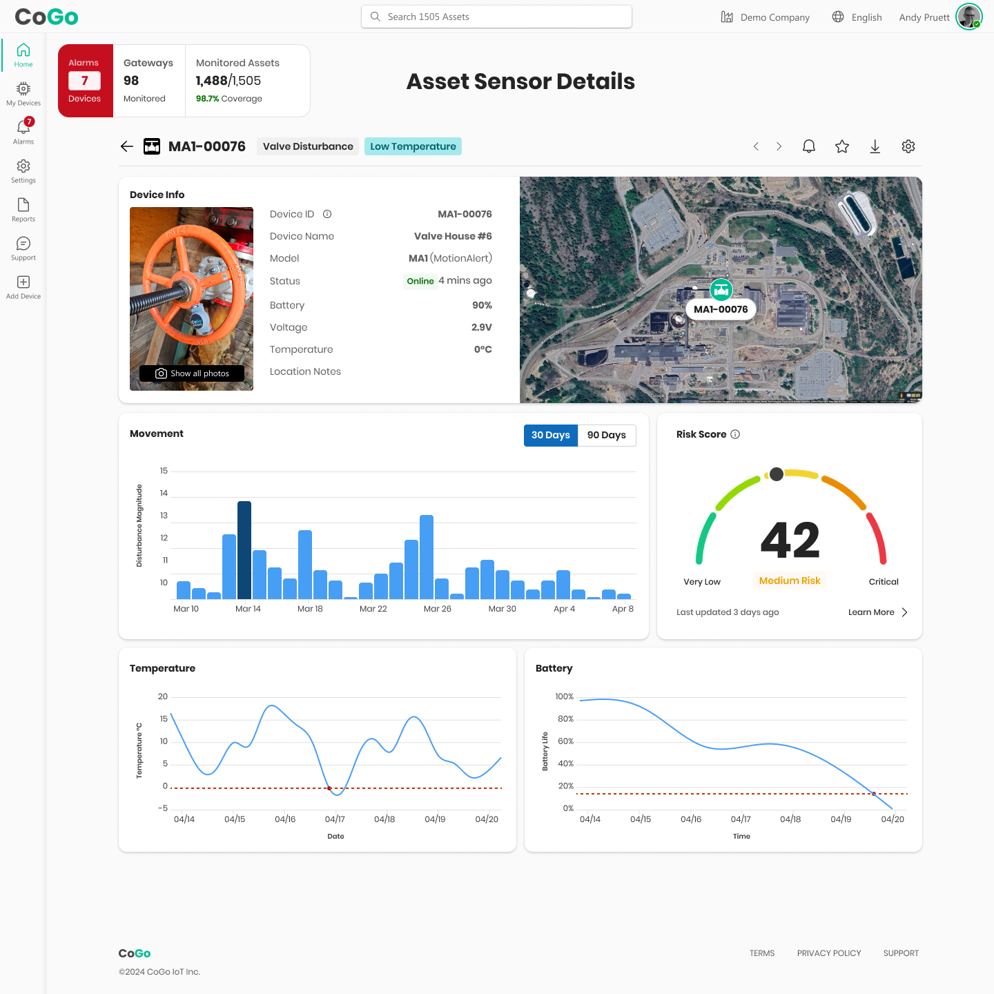
I'm currently working on an Industrial Assets IoT Dashboard for CoGo Global. I'm designing the UX, UI, Design System and Data Visualizations. The Figma prototype can be seen here.
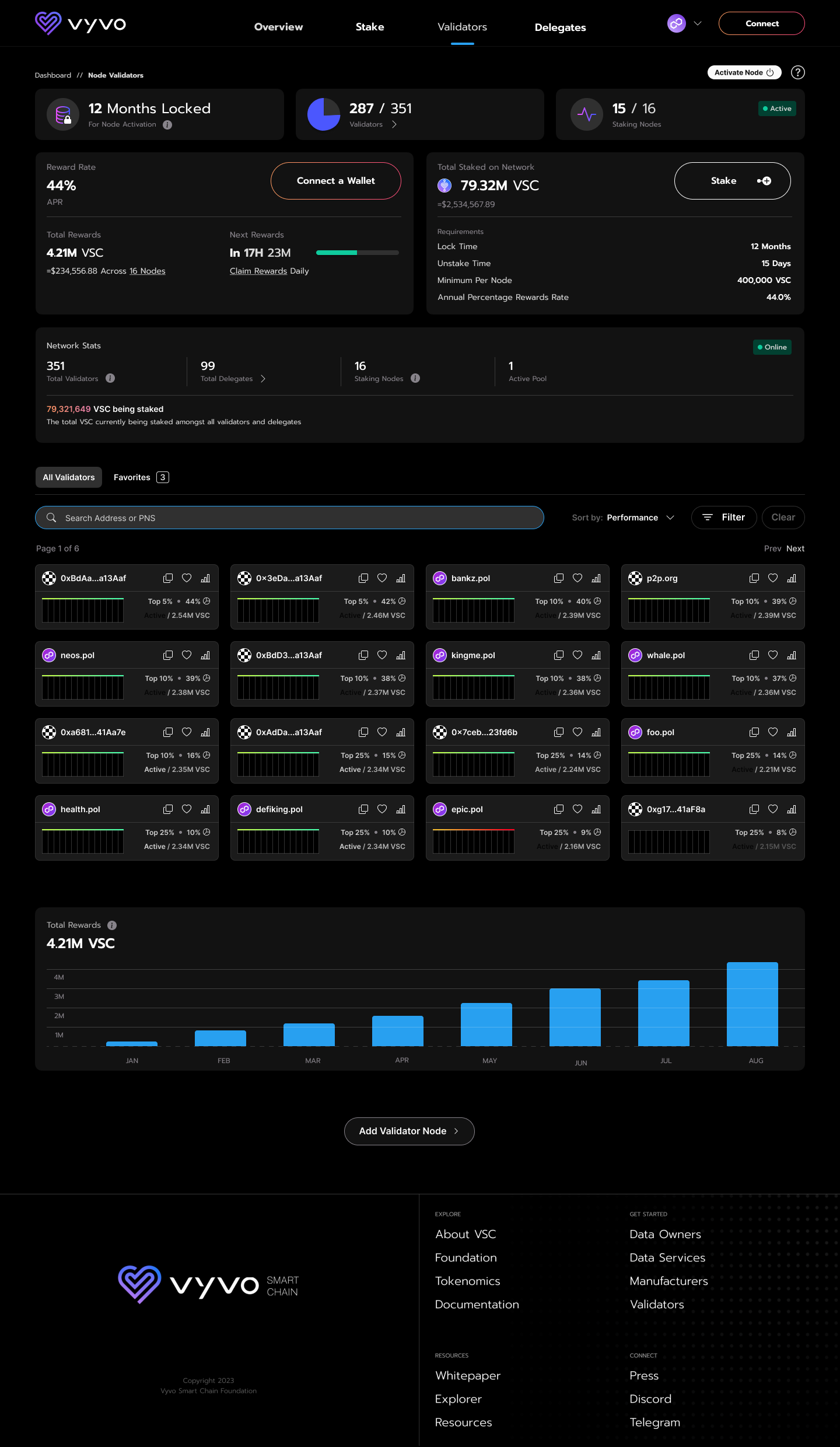
Vyvo Smart Chain project uses Health Data and Blockchain technology for comuunity members to earn and stake rewards. I worked on the marketing sites and Staking Dashboard UX/UI seen above.
Tyler Lange Product Designer & User Experience | © 2024